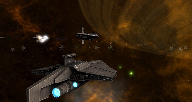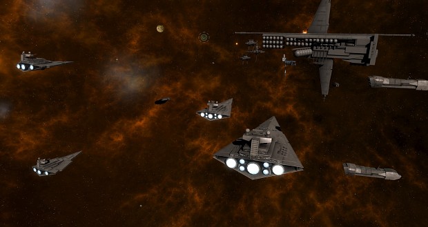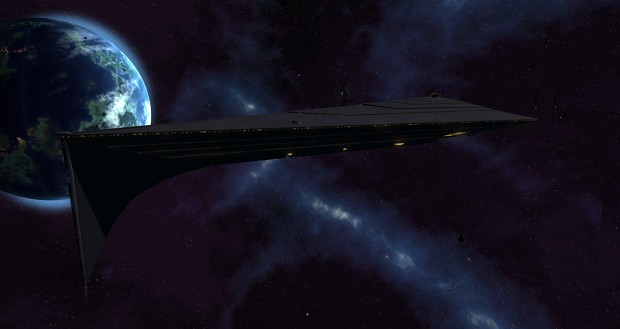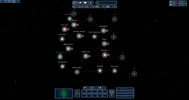
Taking a look at some of the updated UI elements for the upcoming news post (excerpt below, full post being posted soon): " First, one of the more common complaints against 1.0 relate to some of the icons- planetary icons aren't particularly clear, and unit icons tend to take up too much screenspace. We were attempting to simplify the information as much as we could, and also trying to address the icon situation in a way to get around the fact that Star Wars ships in the same faction tend to have a similar profile, making the Sins style less feasible. This was not always successful. The changes to presentation of the unit stacks/force indicators beside planets were also harder for some players to find. So, since the last release OzWolf has redone all of these aspects entirely; unit pips should take up less screenspac, hopefully still being clear enough about what they are, while maintaining the larger more prominent style for planet infrastructure, highlighting its importance and helping it stand out. We still feel that having just renders of the planets, while technically being the most "accurate" isn't always the most clear (especially when so many are primarily green), so we've tried to use some simple, clean symbols to represent them, as you can see below. We've already posted some screenshots in the past of the updated menus and such, so here are some more screenshots of some of the ingame HUD-related changes, including planets, unit icons, and all of that. Crucially, we've also played around with team colours. Hopefully these changes help more easily provide information to players than previous versions.